How to Add a Watermark to a PDF: Text or Logo
By Bishal Neupane · · 2 min read
A watermark tells readers what a document is — a draft, a confidential copy, or your work — before they read a word. Here's how to add one that's visible without ruining readability.
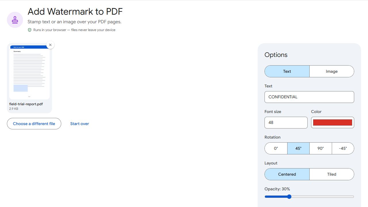
Adding a text watermark
- Open Watermark and add the PDF.
- Choose Text and type your watermark, for example DRAFT or CONFIDENTIAL.
- Set the font size, colour, opacity and rotation. A 45° diagonal at around 20–30% opacity is the classic look.
- Choose Centered for one large stamp per page, or Tiled to repeat it across the page.
- Click Add watermark and download.
Adding a logo
Choose Image and add a PNG or JPG of your logo. A PNG with a transparent background looks best. Lower the opacity so the page content stays readable, and pick a position — a small logo in a corner works well for branded documents.
Watermark or footer?
If you only need a quiet line of text on every page — like "Confidential – for internal use" — a footer is less intrusive than a watermark across the content.
What a watermark can't do
A watermark discourages copying and makes ownership clear, but it isn't protection: someone determined can edit it out. Don't rely on it for truly sensitive material, and never on a watermark alone to hide information.
Watermark a copy for sharing and keep your clean original.
Common problems and fixes
- The watermark hides the text.
- Lower the opacity to around 15–25%, use a lighter colour, or make it smaller.
- The logo looks pixelated.
- Use a larger image, ideally a PNG at least 1000 pixels wide, at a smaller scale.
- The logo has a white box around it.
- Use a PNG with a transparent background instead of a JPG.
- I only want the watermark on some pages.
- Enter those pages in the pages field before applying.
Frequently asked questions
A determined person with editing software can. A watermark discourages misuse and shows ownership; it isn't a security measure.
20–30% for a diagonal text stamp keeps the content readable. Logos in a corner can be more opaque.
Centred is cleaner for drafts. Tiled covers the whole page, so it's harder to crop out of a screenshot of a sensitive page.
No. You download a new, watermarked copy; the original stays unchanged.